LIFE TIME BRAND
A healthy update.
Evolving, aligning, defining and documenting the Life Time brand. Including;
More authentic and inclusive lifestyle imagery art direction.
Elevated architectural photography.
Consistent iconography, illustration and floor-plan design.
Clarified brand architecture and sub-brand strategy.
Lifestyle Photography
Spearheaded a strategic shift from brand shoots being primarily done in-studio using professional fitness models — to on-location shoots featuring team members of all ages, sizes and races as our stars and muses.


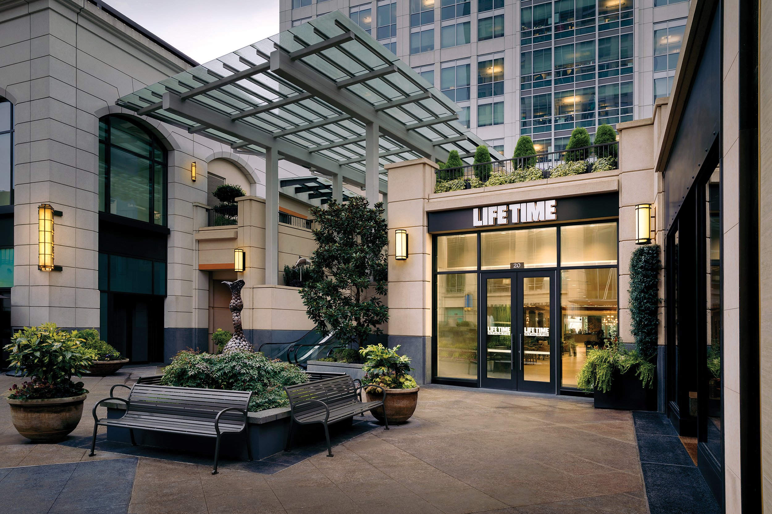
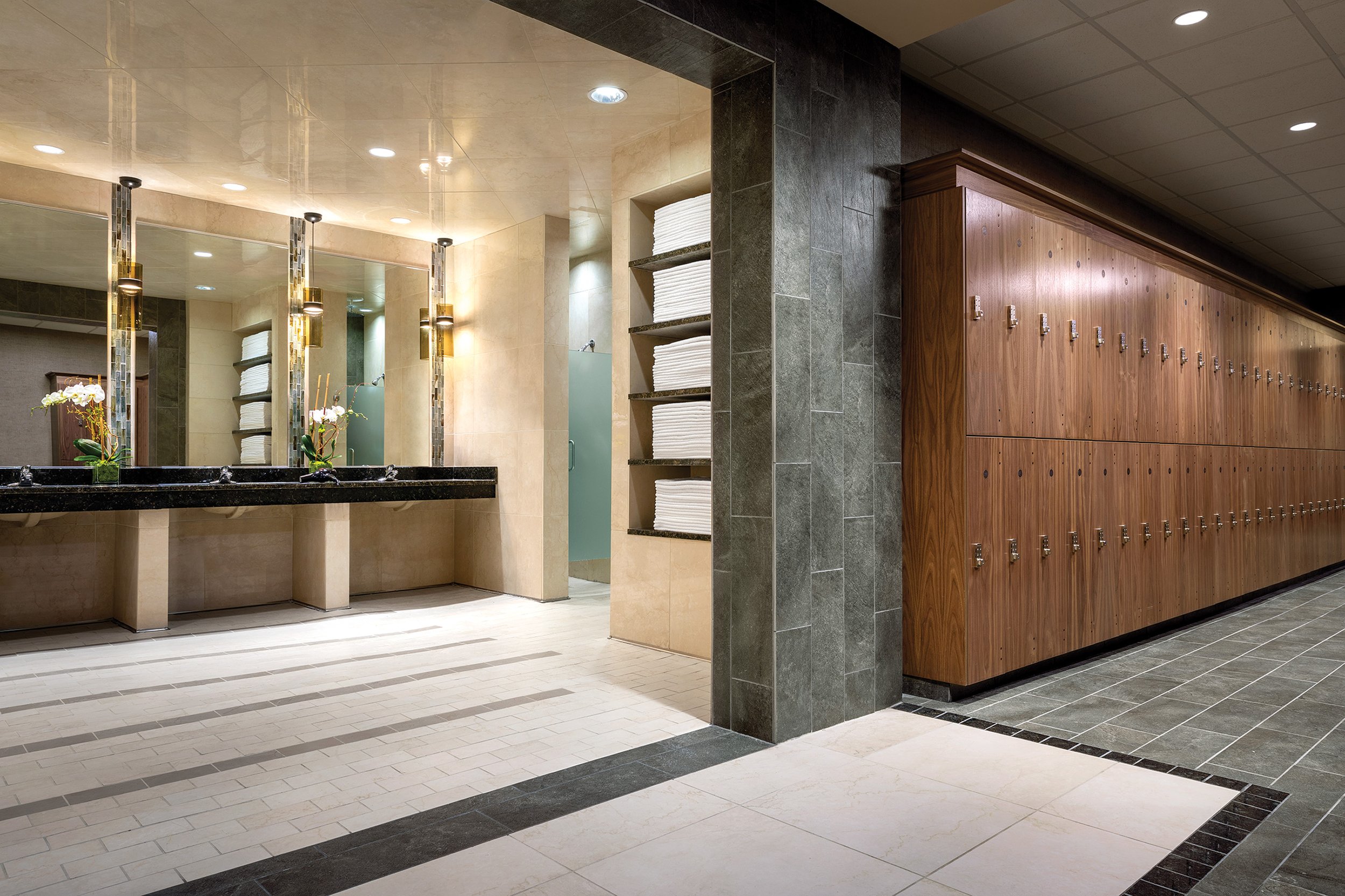
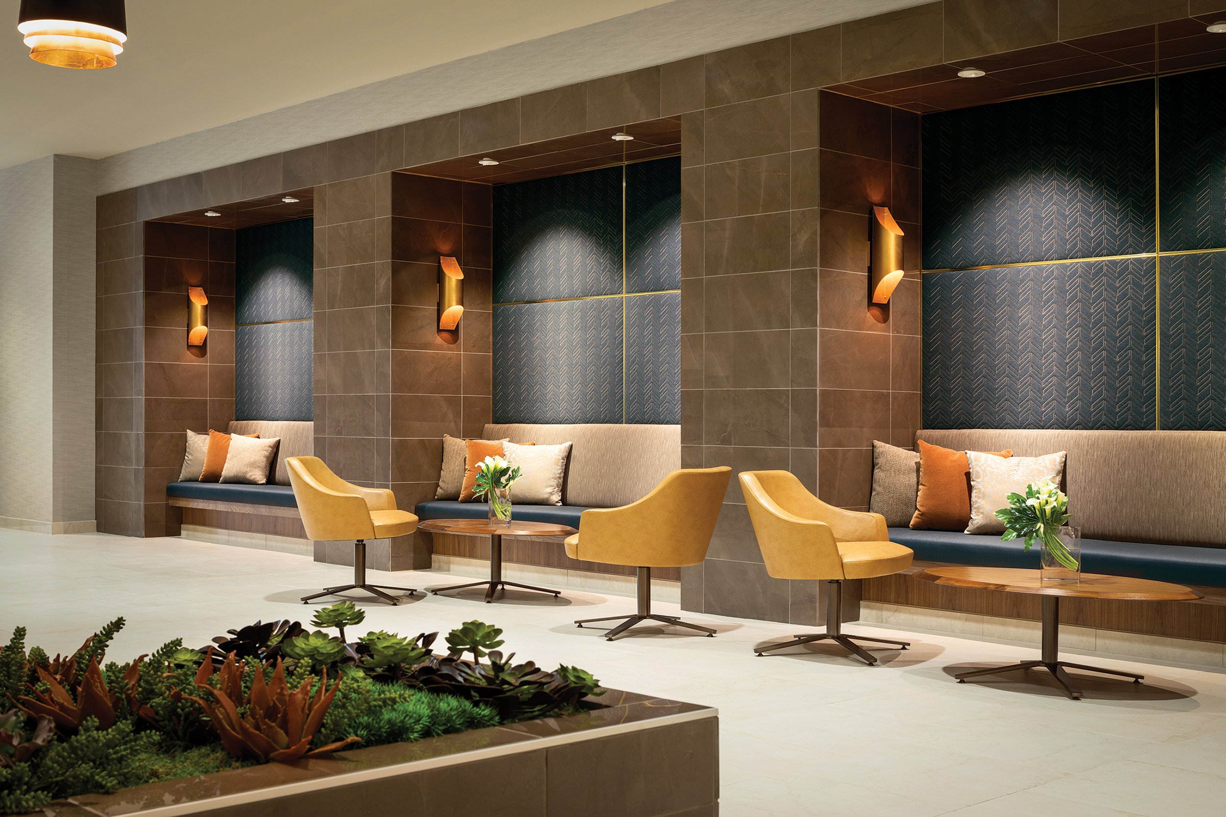
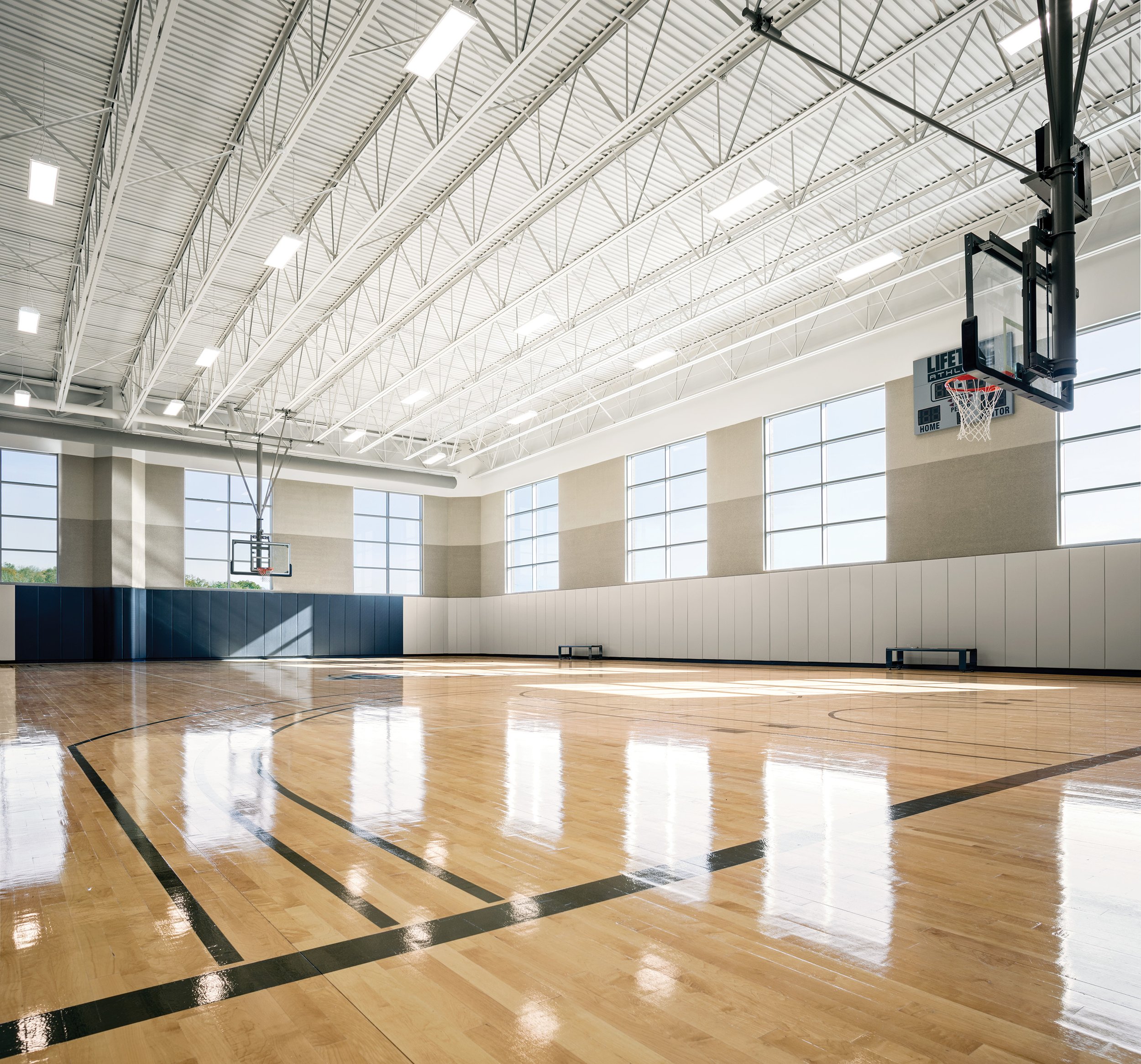
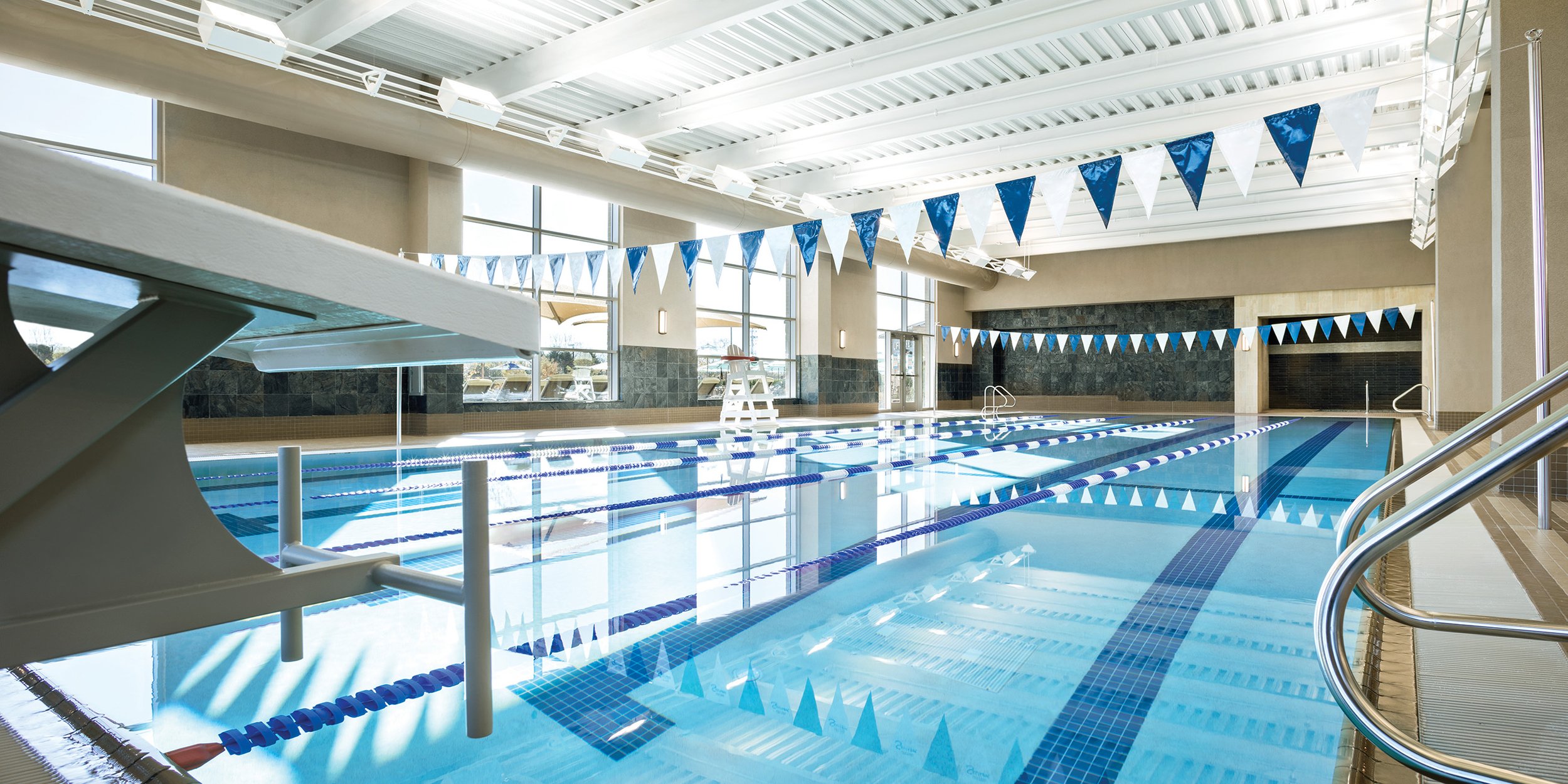
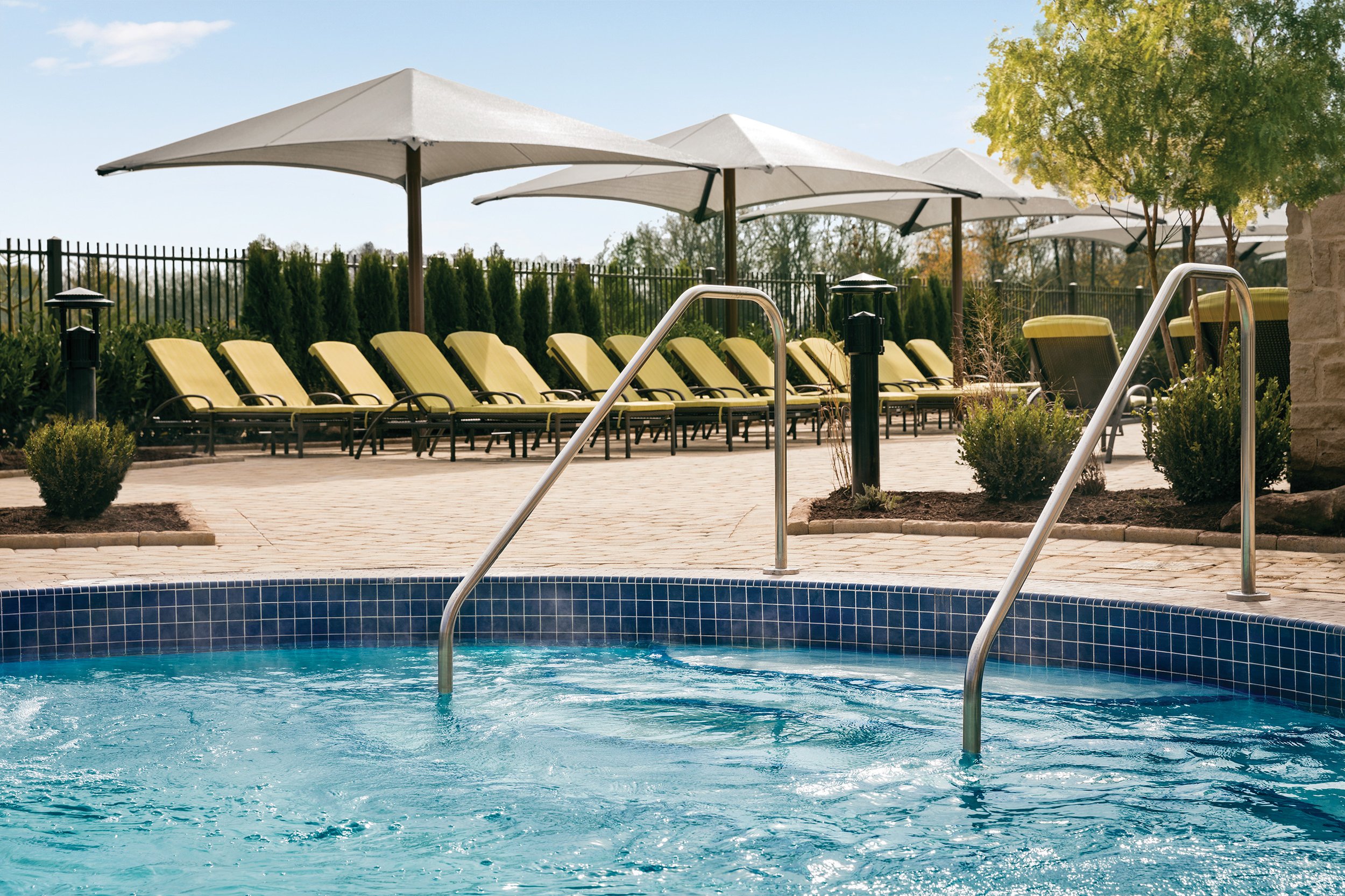
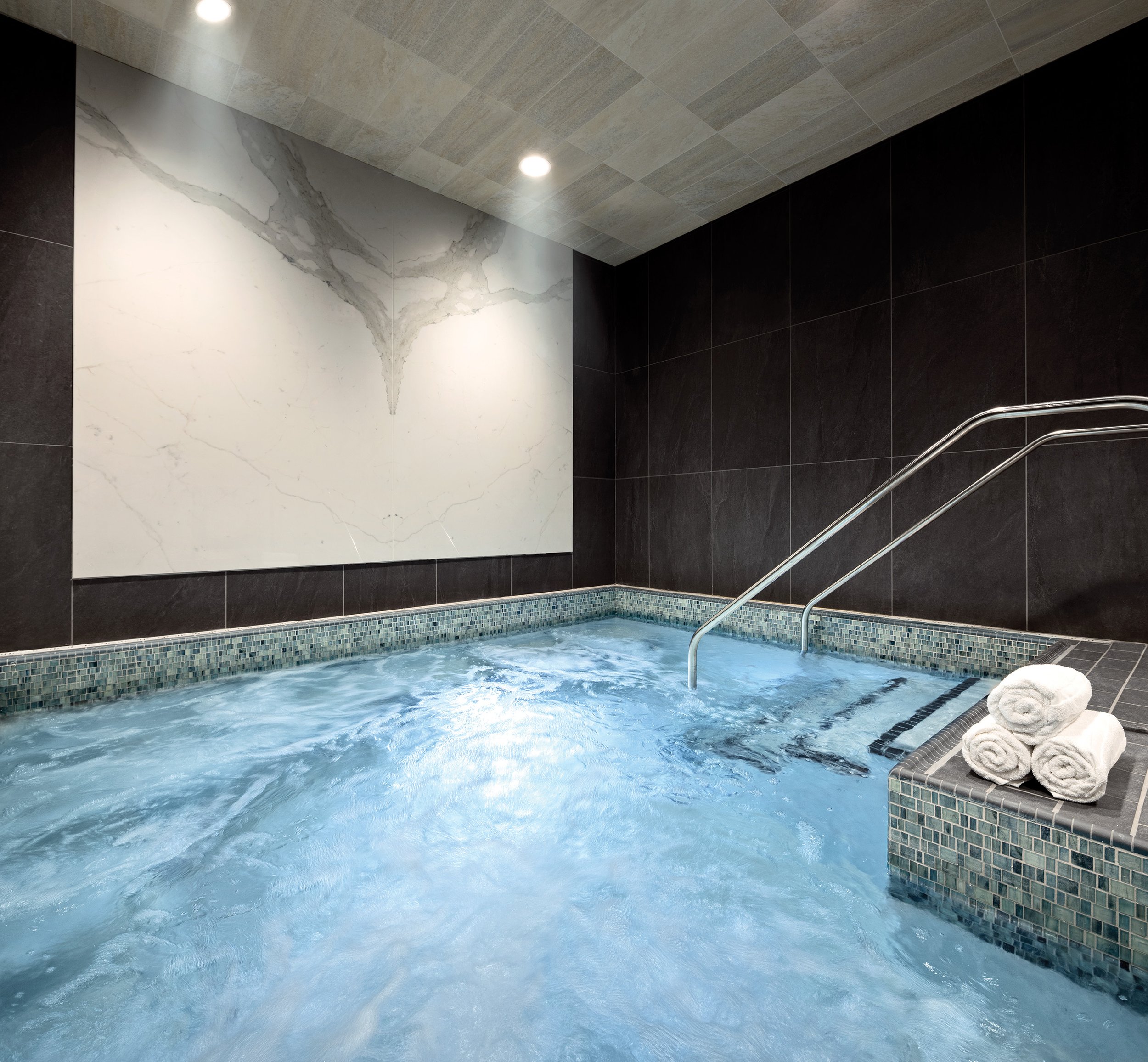
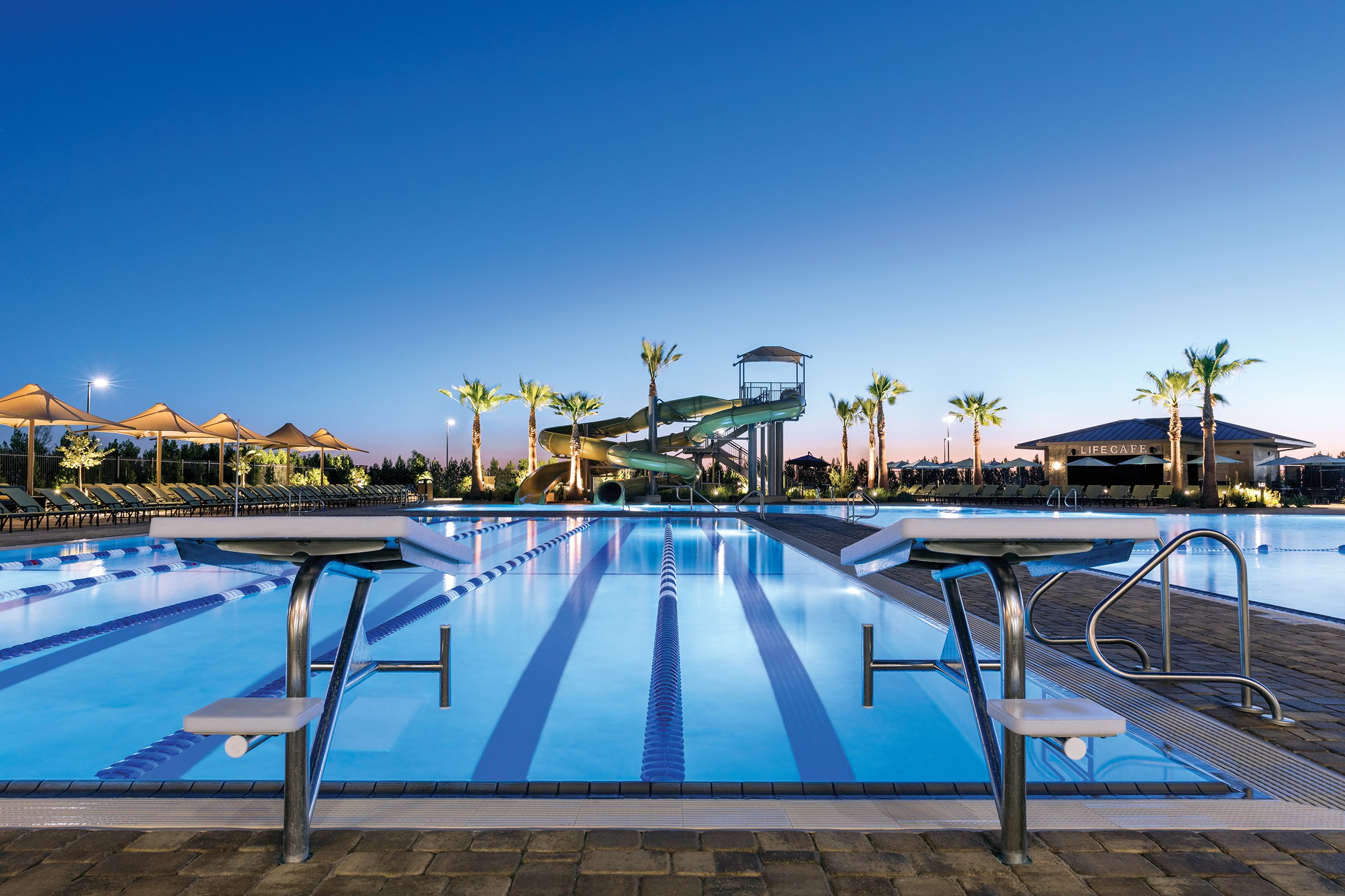
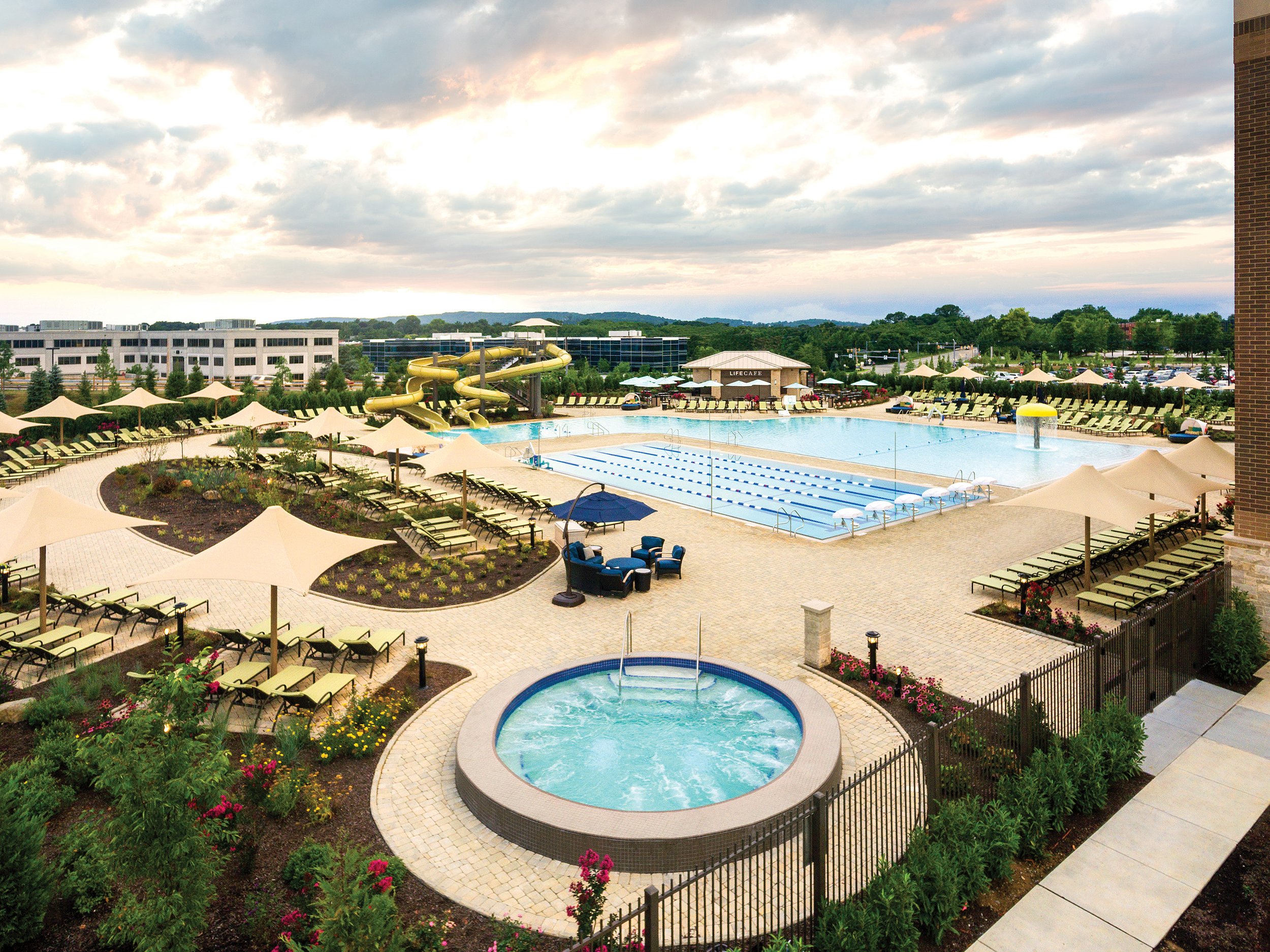
ARCHITECTURAL PHOTOGRAPHY
Life Time’s spaces are one of its key differentiators, but little creative strategy had been invested in capturing these spaces. I spearheaded an initiative to invest in our capturing every area of ours clubs in its unique glory — from powerful cycle studios, to pampering spas, to innovative fitness floors.
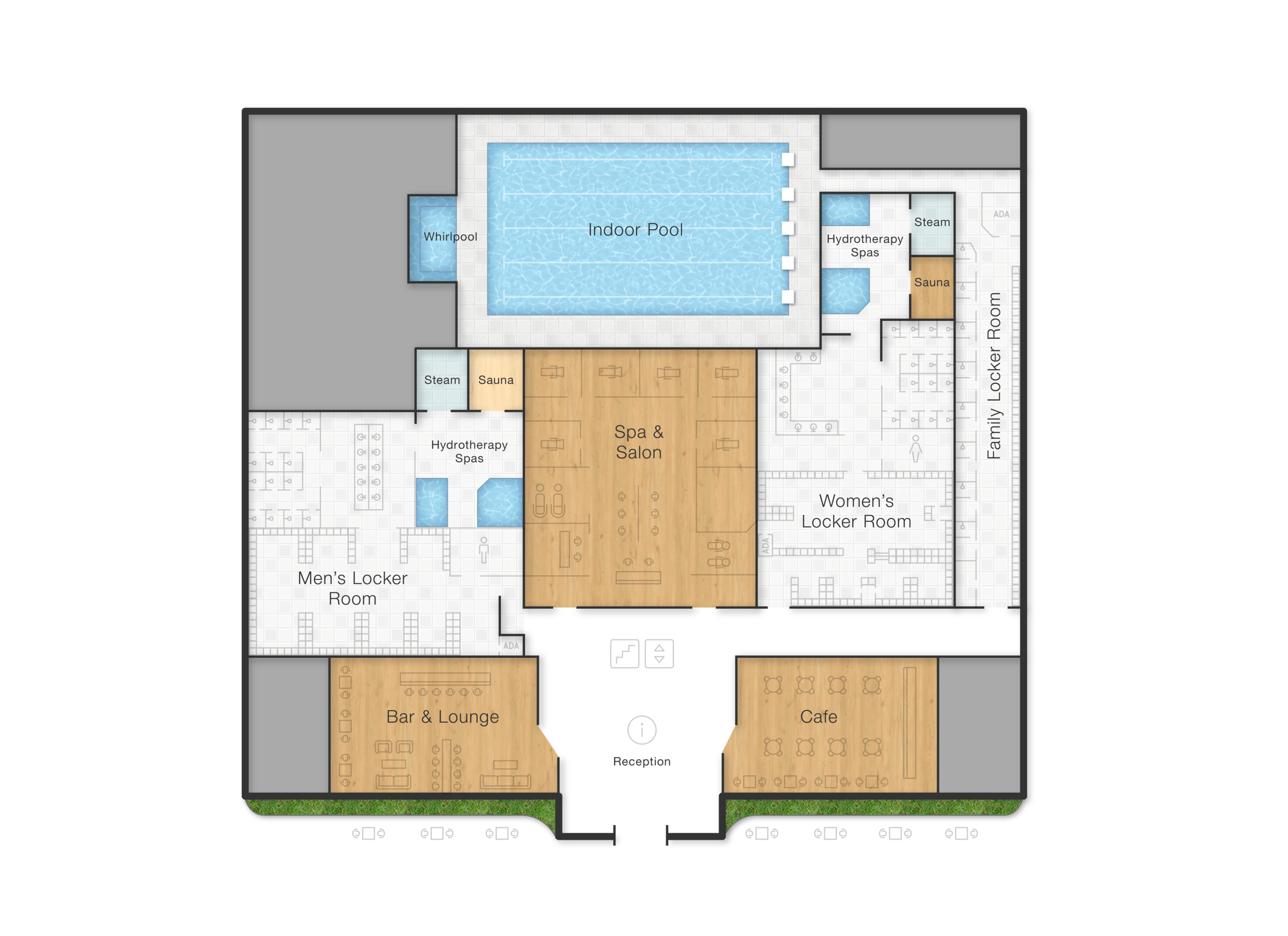
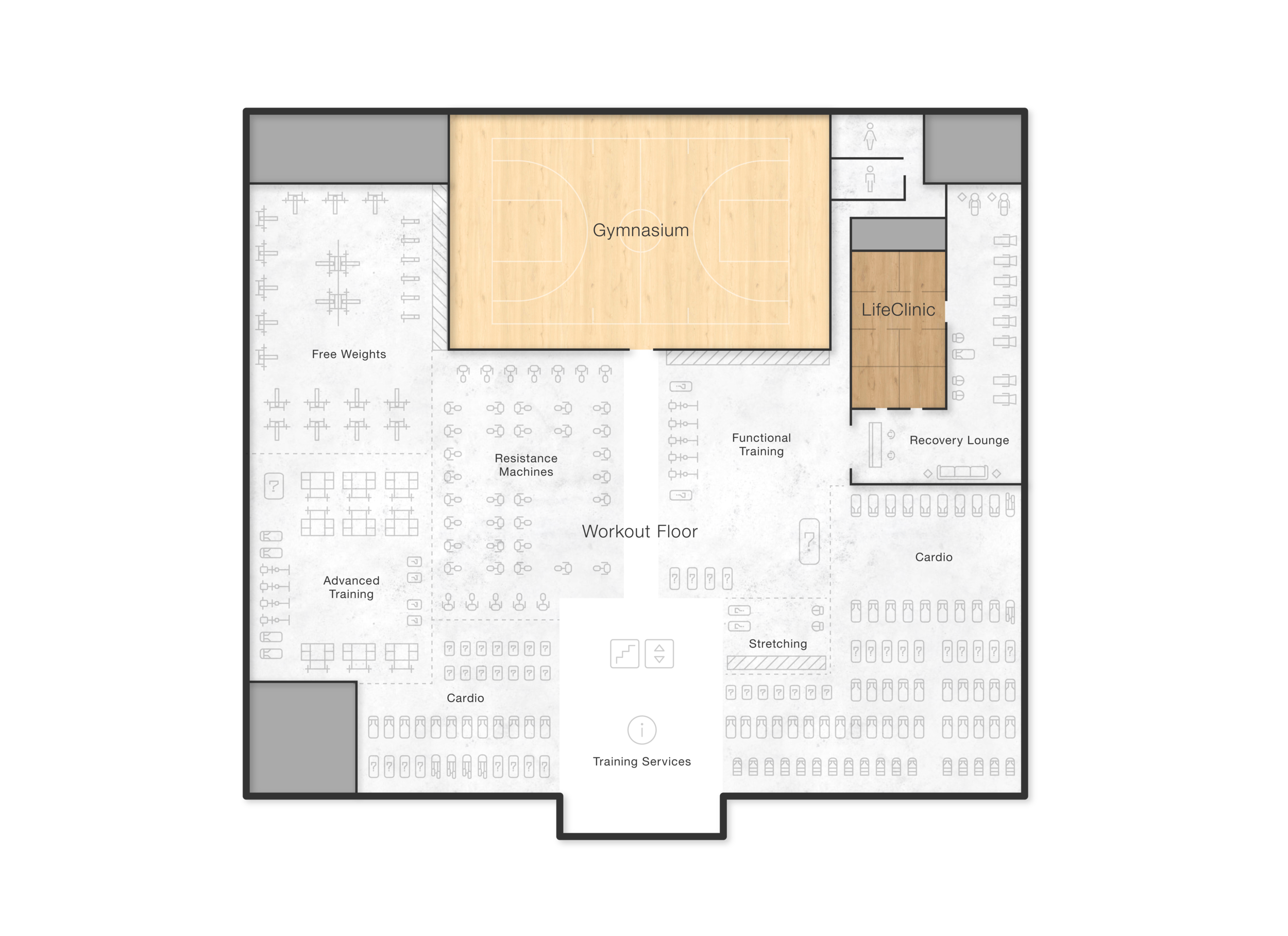
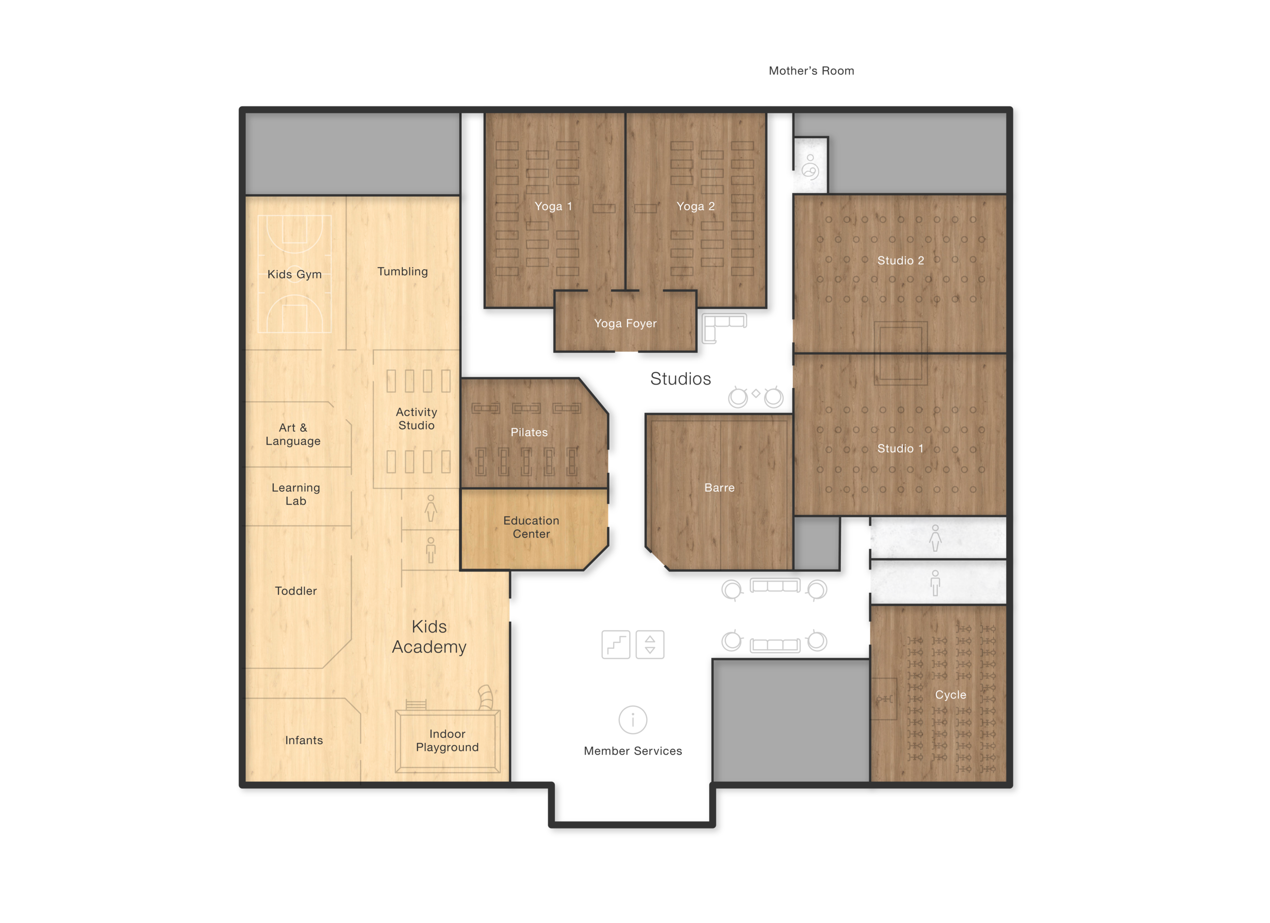
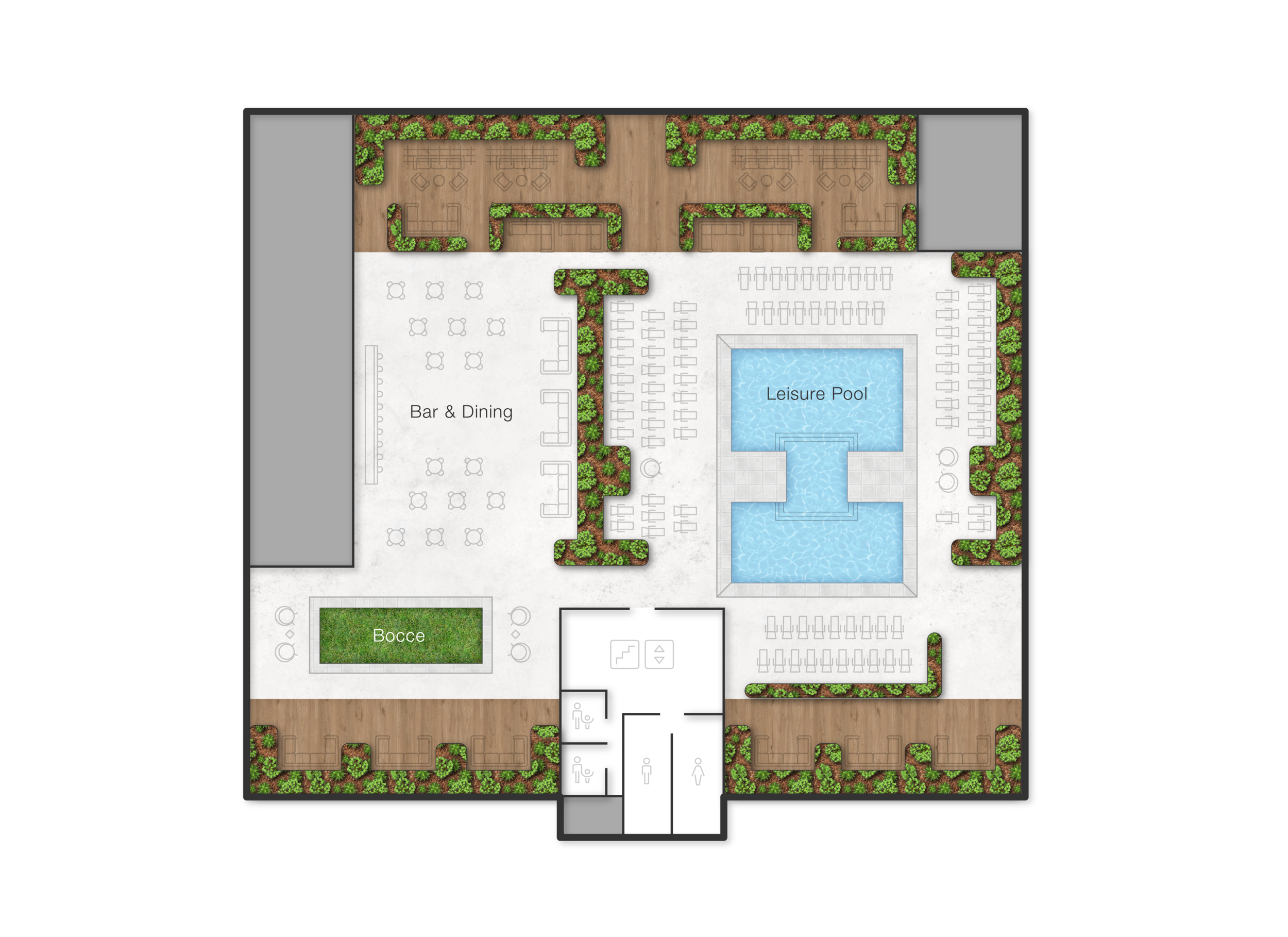
Floorplans
Created a rich and textural — but still modular and flexible design. Levels of detail could be turned on or off, depending on the medium. For example, all furniture-level detail would be displayed when using the floorplans for marketing purposes, showcasing the scale of the clubs and the quantity of equipment, but tthis extra detail would be turned off when using the floorplans in small executions or for simple way-finding.
Badge Iconography
Create an omni-channel, cross-functional (oh, sooo many buzzwords) iconography toolkit. Unified design characteristics allowed any designer on the 7-person team to create new iconography that fit within, and could be permanently added to, our brand library of icons.
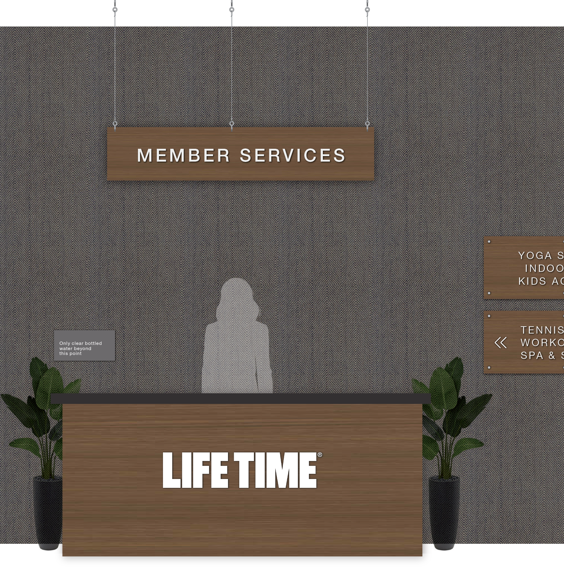
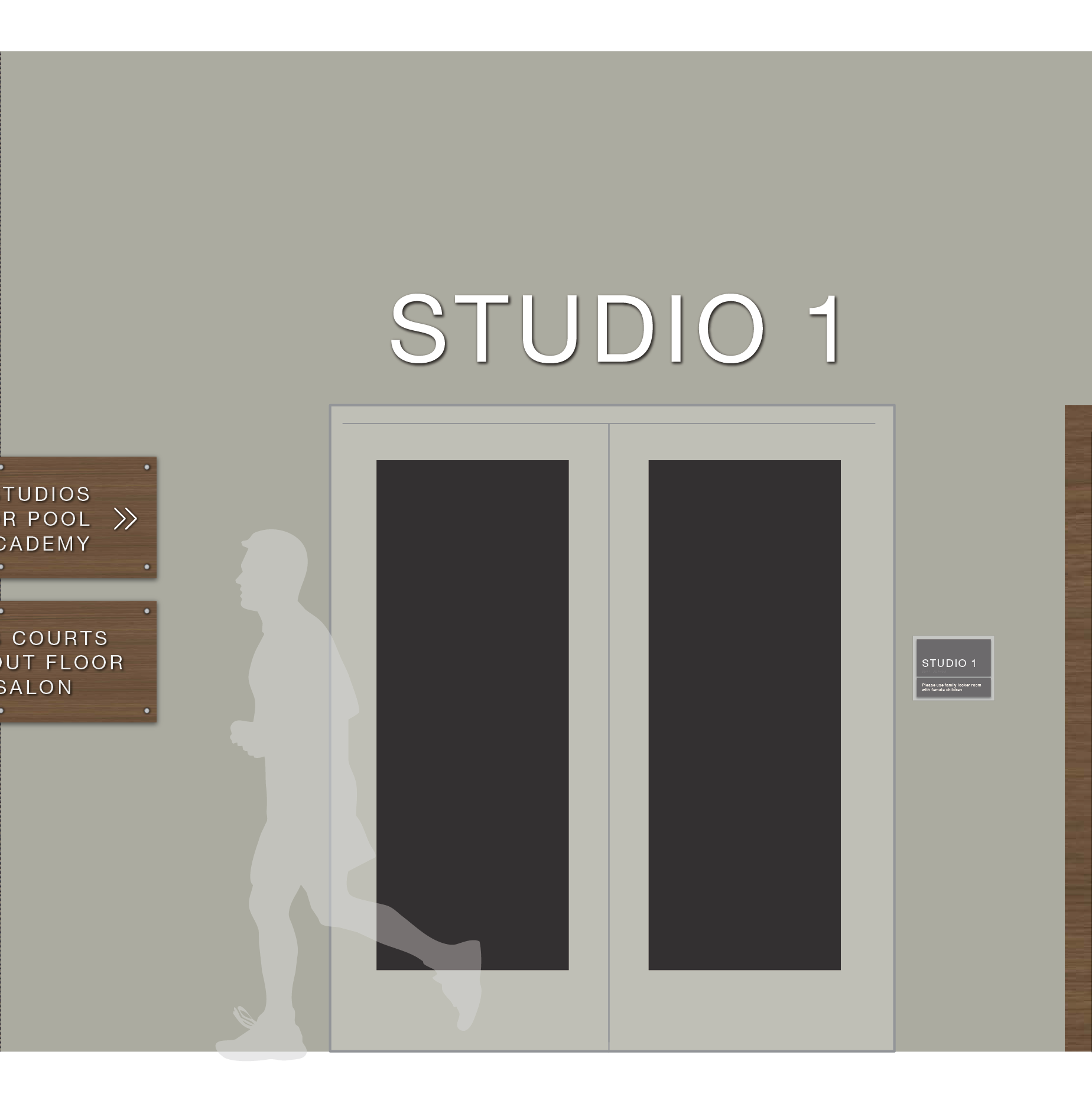
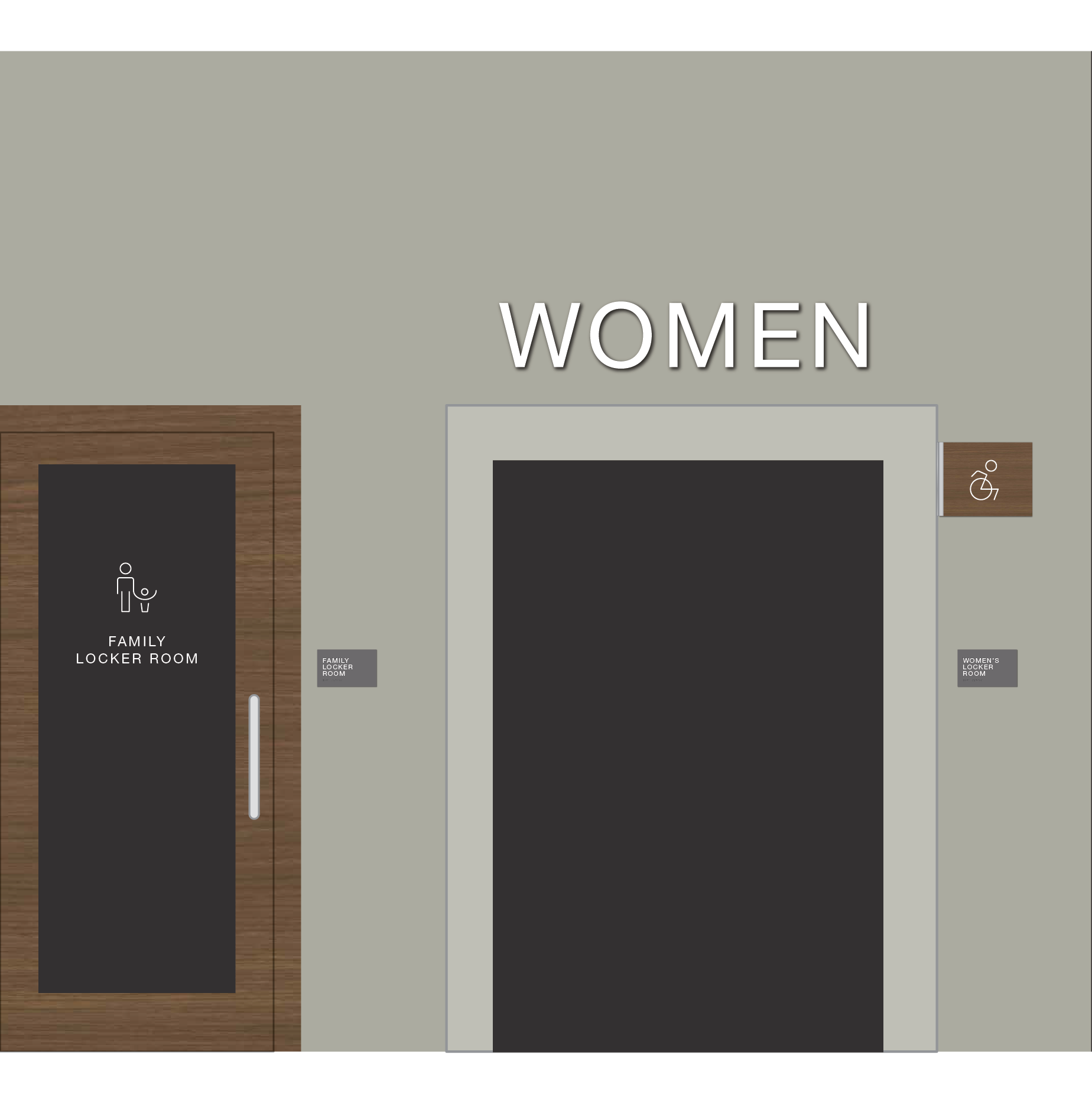
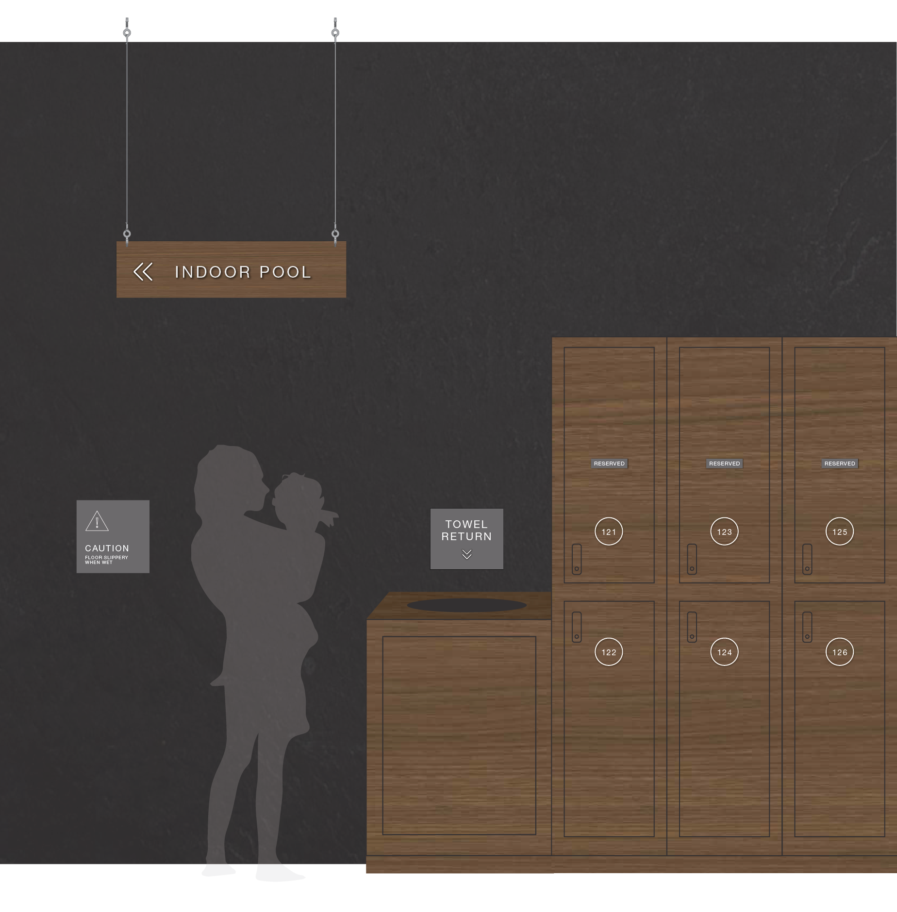
in-Club Signage Revamp
Elevated the look of an outdated way-finding system while also streamlining the toolkit and working within ADA guidelines.
CREDITS
VP of Creative: Marc Stephens
Director of Voice: Jack Fahden
Photographer: Kelly Loverud
Project Manager: Emily Ray
Copy Editor: Emily Ewen