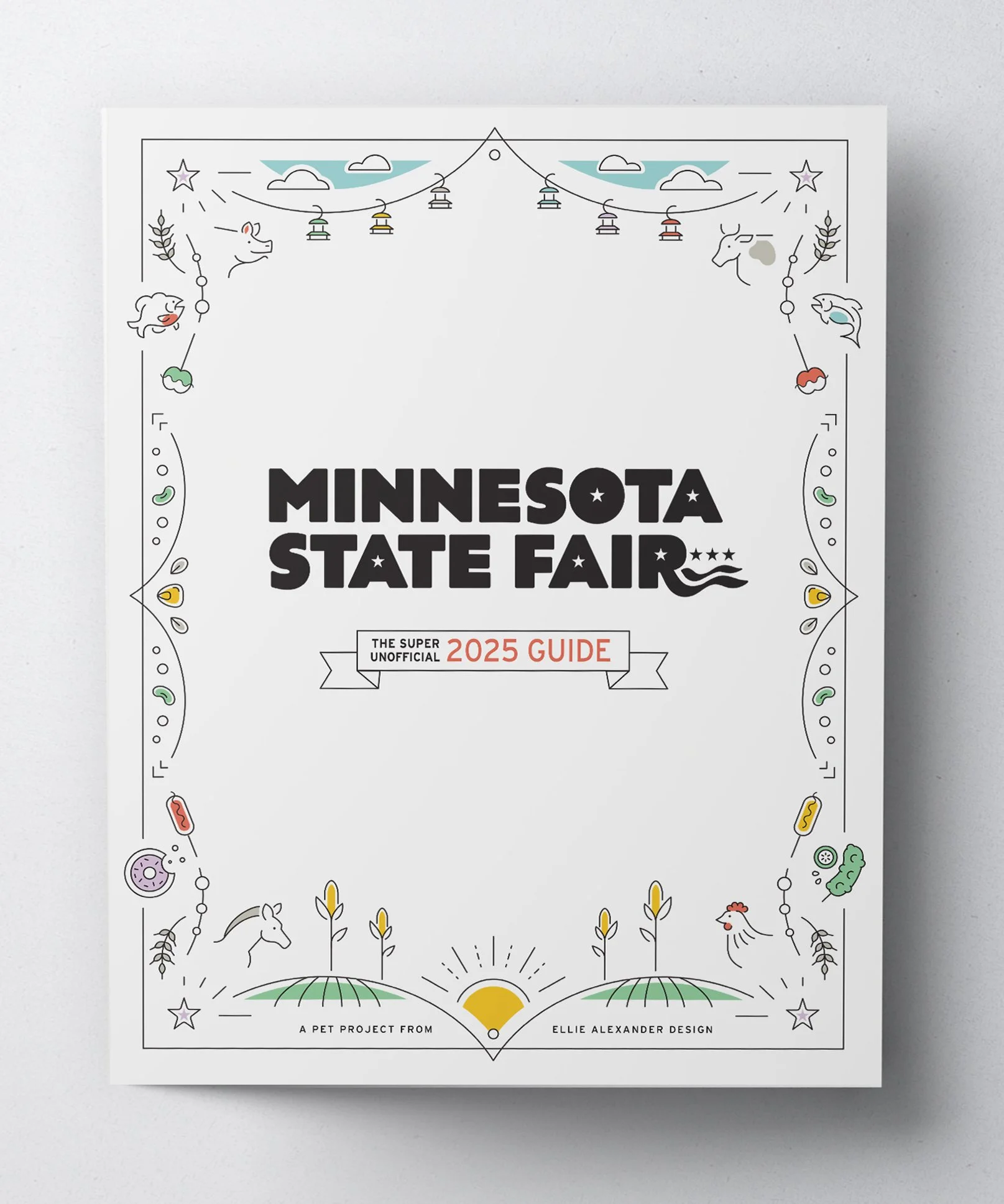
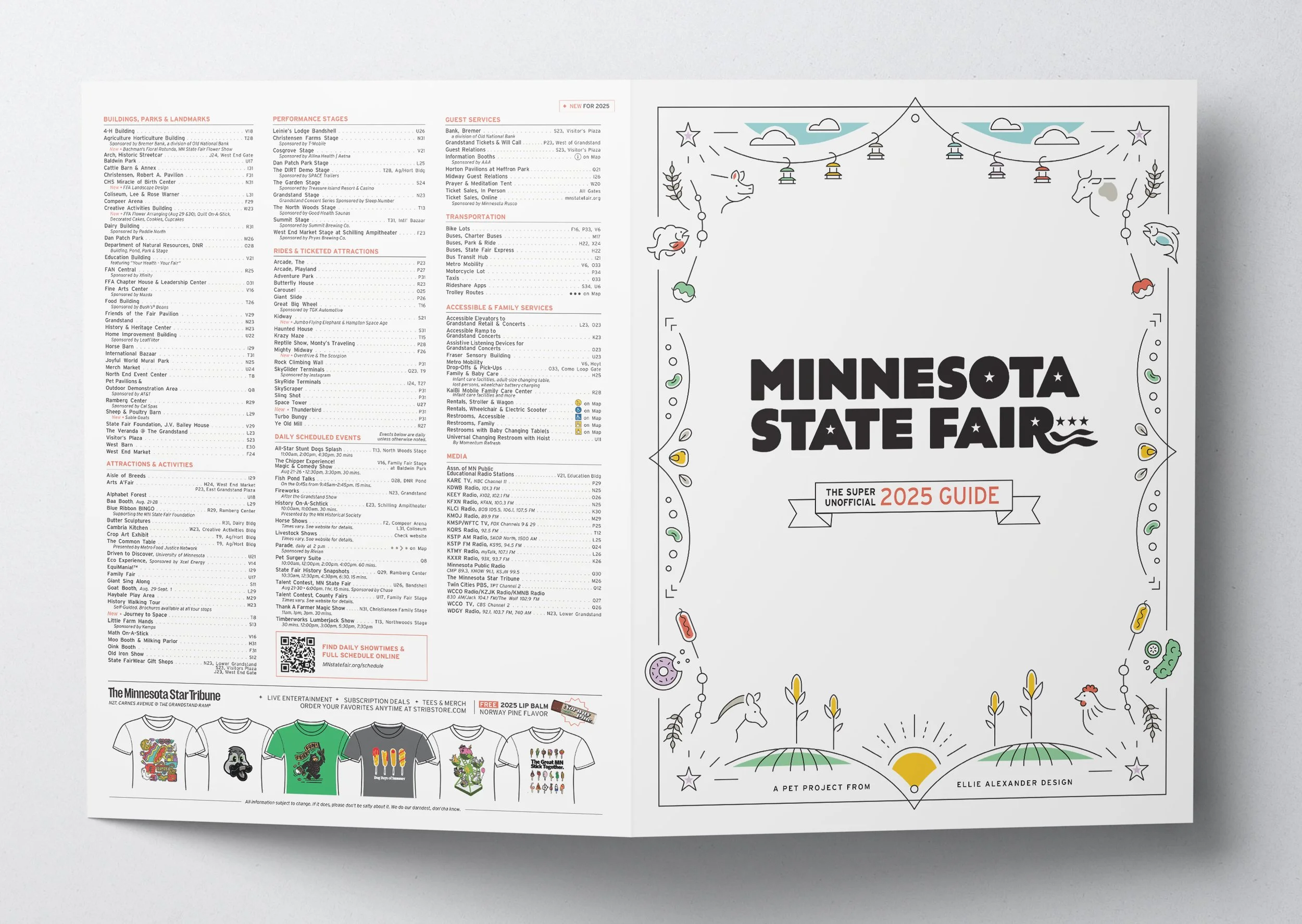
This is what happens when a designer loves the Minnesota State Fair.
A personal project fueled by dreams of food on sticks and an itch to design something both fun and functional.
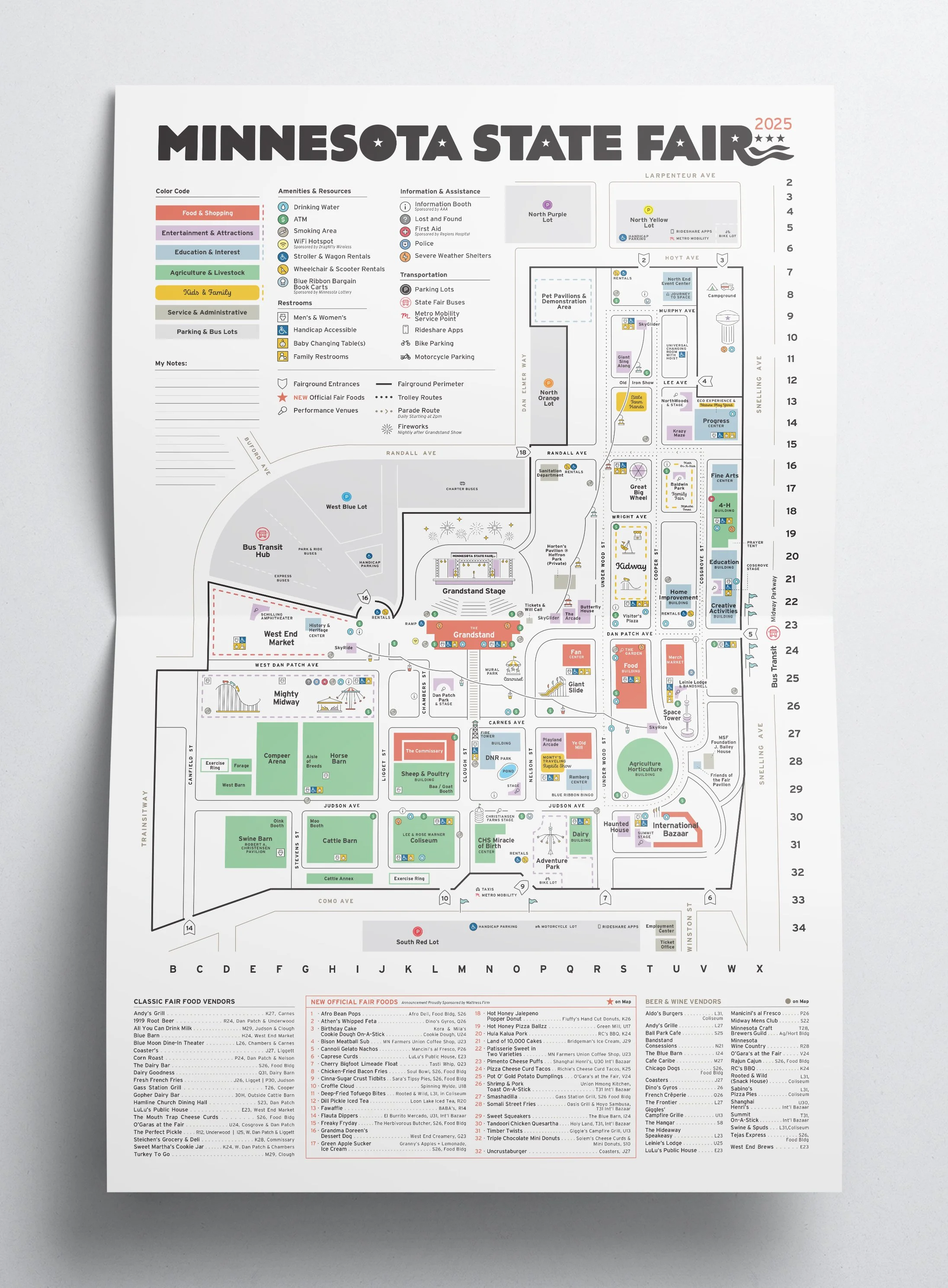
In the summer of 2025, I was planning our annual family trip to the fair, so I downloaded the official Minnesota State Fair map. I realized what a fun opportunity and challenge it would be to modernize the design and make improvements to the in-print user experience.
So, in true Virgo fashion, I made my own.
Simplified, Modernized Illustrations & Icons
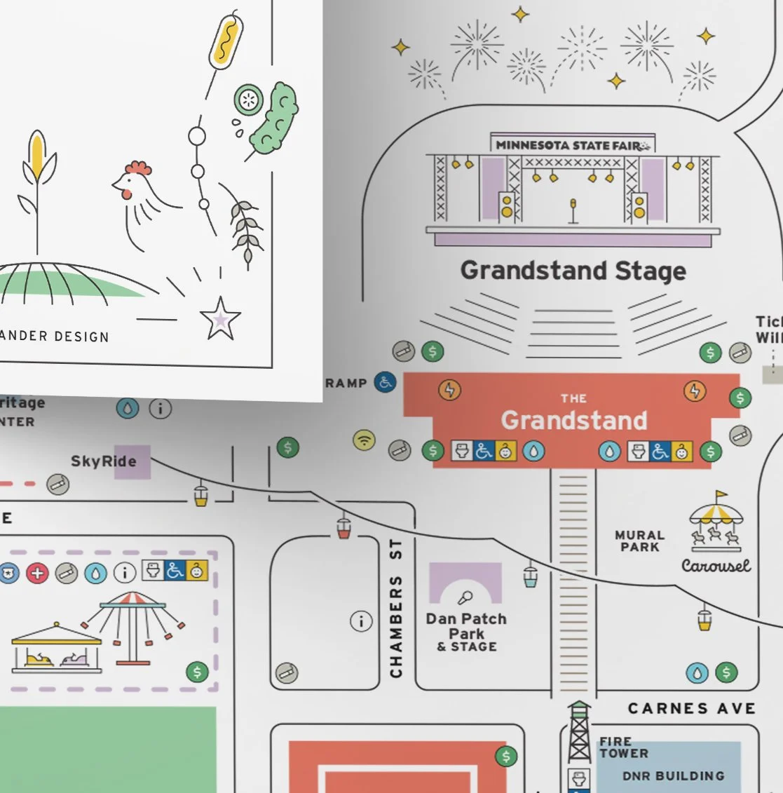
The existing illustrations were iconic, but very intricate. This created a visual competition with the map’s utilitarian features. So, I simplified them in a way that maintains their charm, while making the map easier to visually navigate.
Adding a Color Code
Color coding the buildings & areas by interest (Food, Agriculture, Kids, etc.) makes it easy for the user to navigate to the areas that appeal to them.
Adding the FOODS!
C’mon, let’s be honest — we’re all here for the food. So I added a key and markers for the classic and new foods.
Optimized Type
The existing font was condensed and all caps, which can be hard to read at small sizes. So I switched the font to “Interstate”, a font designed to improve distance legibility of text on highway signage. It provides the same readability improvements to a small type on this printed map.